| MALAYSIA
UX CASE STUDY
RESEARCH // IDEATION // SKETCHING & WIREFRAMES // PROTOTYPING // CONTENT STRATEGY // USABILITY TESTING
00 / PROJECT SUMMARY
TIMEFRAME
2 Weeks Research
3 Weeks User Testing
2 Weeks Design
MY ROLE
UX Designer
Product Strategist
User Researcher
TOOLS
Figma
Illustrator
MIRO
MENTOR
Nick Busman
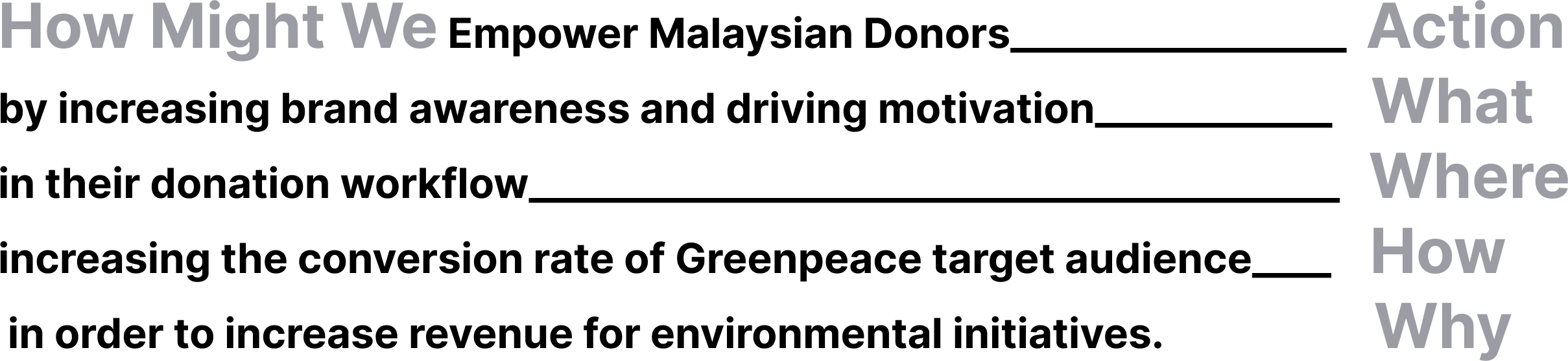
HOW DO YOU INCREASE AWARENESS?
The Problem
Greenpeace Malaysia's brand awareness is low which negatively impacts the donation and conversion rate of reoccurring target donors.
I have teamed up with Greenpeace Malaysia and Harness Projects to research and develop an experience to motivate and empower Malaysian donors in their donation workflow to help increase donation rates for Greenpeace initiatives.
THE CHALLENGE
Greenpeace awareness is low (number 18) at only 23%.
And trustworthiness and reliability were the top criteria for charity support followed by knowledge of impact.
KPIs
Increase brand awareness.
Reoccurring Donations.
Connecting with users through alternative touchpoints.
Higher conversion rate among Target user group.
Increased campaign transparency.
THE SOLUTION
Revamp landing page hierarchy to attract and funnel users to the donation page.
Invigorate story map to visually connect users directly to environmental impacts.
Increase transparency of how donations are used.
Improve the donation page experience.
Simplify an accordion method to split payments across campaigns.
Generate higher sense of user control through options for users to select the specific campaign(s) and payment methods.
HYPOTHESIS…
*Creating an experience that captures the social impact and environmental impact directly to users*
01/ DEFINE THE PROBLEM
Now let’s start from the beginning…
GOALS
First I identified a list of KPIs and goals that Greenpeace wanted to achieve based on our client interview.
Lifestyle changes at the individual level by connecting to problems.
Retain donors by connecting to values and converting emotional decisions to rational decisions through information and reward systems
Attract new donors and tap into different markets through efficient channels at pre-donation exp and post-donation exp.
Build stronger brand identity through captivating UI, page hierarchy, and focus on top/current issues and mission-driven campaigns.
SECONDARY RESEARCH
Our client was diligent in identifying the LTV (Lifetime value) per active target donor profiled. The target donor represents 8% of Greenpeace Malaysia monthly donors but only 30% of the overall donations, including 95% of active donors.
Insights Report
The target donor represents 8% of Greenpeace Malaysia's monthly donors.
SECONDARY RESEARCH
2 out of 3 users were located in an Area of Interest.
Geospatial Analytics
Mapping geospatial impacts to identify Areas of Interest on the Malaysian mainland contextualizes the direct targeting of donors that have more physical consequences to the variables in the Socio-ecological framework.
Geospatial Layers

Areas of Interest on Malaysia Mainland

COMPETITIVE ANALYSIS
Summary
Using insights from the Greenpeace team and data analytics, I have identified over 50 comparable NGOs, four of which I identified as being most comparable in terms of campaigns, target groups, financing, and other critical criteria.

COMPETITIVE ANALYSIS
Overall, 60% of the competitors audited featured campaigns impacts at least twice on their page.
COMPETITIVE ANALYSIS
The assessment revealed the importance of the landing page to capture the target audience and lower the bounce rate.
Competitive Analytics
After evaluating data from several analytic sites, the comparative analysis revealed that the views per million a week were directly connected to news mentions and social media trends. Although the client’s budget did not account for advertisement, the assessment revealed the importance of the landing page to capture the target audience and lower the bounce rate.


Hypothesis
After assessing the Insights data provided by Greenpeace Malaysia, and secondary research of donation trends I determined that target donors are more likely to trust donating to a direct best channel to reoccurring donations from the target donors happen from the landing page to the donor page.
03 / EMPATHIZE WITH USERS
USER INTERVIEWS
“I care a lot about the environment, I am donating to three NGOs and I volunteer when I have time. I found out about Greenpeace through direct face-to-face, which I trust more”
— Participant 1
“Climate change affects me directly, especially flooding… I would donate to something that would benefit my son, it offers something to future generations, a better living environment. Something that is tangible that I can experience the effect of it.”
— Participant 3
“I like the page but it seems a bit confusing, I’m not sure where to look.”
— Participant 2
“I’m not familiar with Greenpeace, are they the panda?... I would donate sure, but I would like to know how it would help.”
— Participant 4
USER TESTING & INTERVIEWS
Approach
With the help of UX ARMY, 30 participants were interviewed and tested.
Malaysia 16 males and 14 females from Kuala Lumpurn ages 20s - 40s. The questions focused on knowledge, donation practice and motivations, and social values. Each participant was asked the following questions and then monitored on how they navigated through the Greenpeace website and donation page.

Example questions:
How much knowledge do you have of Greenpeace and its current campaigns?
What motivates you to donate to NGOs, and Greenpeace specifically, what has been your experience?
What do you deem the most important issues and what are some of your suggestions on how Greenpeace could best solve them?
USER TESTING & INTERVIEWS
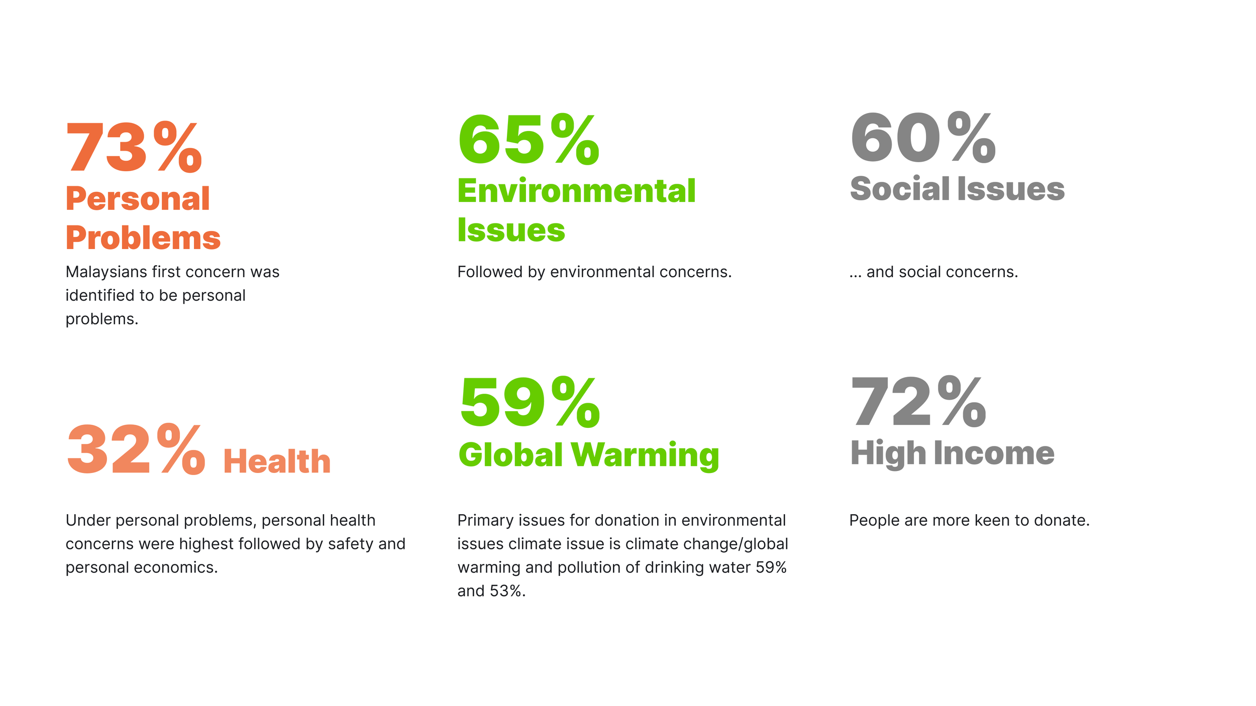
Findings
The main themes discussed centered around ease of navigation, knowelege of issues, and awareness of Greenpeace as it relates to personal values.
Brand Awareness & Communication
66% of users wanted to know how their donations were being used.
75% of users said the default donation amount of 60 ringgits was too large.
Currency choice is not available.
Accessibility & Usability
Easy navigation to learn more about the issues they care about the most.
Donation and Landing pages have a high contrast and little visual hierarchy.
Some content is out of date and does not translate into multiple languages.

Donations & Transparency
Only 60% of Users never heard of Greenpeace
55% of users could not confidently identify campaigns.
The sharability of Greenpeace posts from the website was not available.

Motivations & Values
2 out of 3 participants mention housing shortages to be their primary concern and source of most income stress.
75% of users interviewed were located in Areas of Interest.
Two third of participants were unsure of values associated with the organization.
PRIMARY RESEARCH
Card Sorting
I explored the primary channels from our research and client interviews to establish the optimal user journey that would generate the most conversions.
Generative research revealed that Greenpeace Malaysia’s target audience (people 35-44 years old) prefers to use Facebook. The lack of social media presence or channels on Greenpeace Malaysia’s main page is a shortfall that can miss leads from social media to the donation page in various forms.
Source: yougov
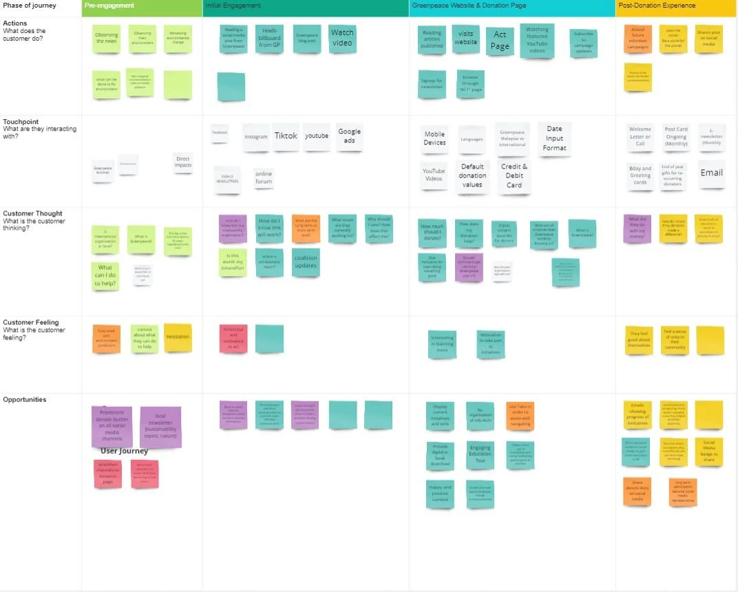
User Journey Map
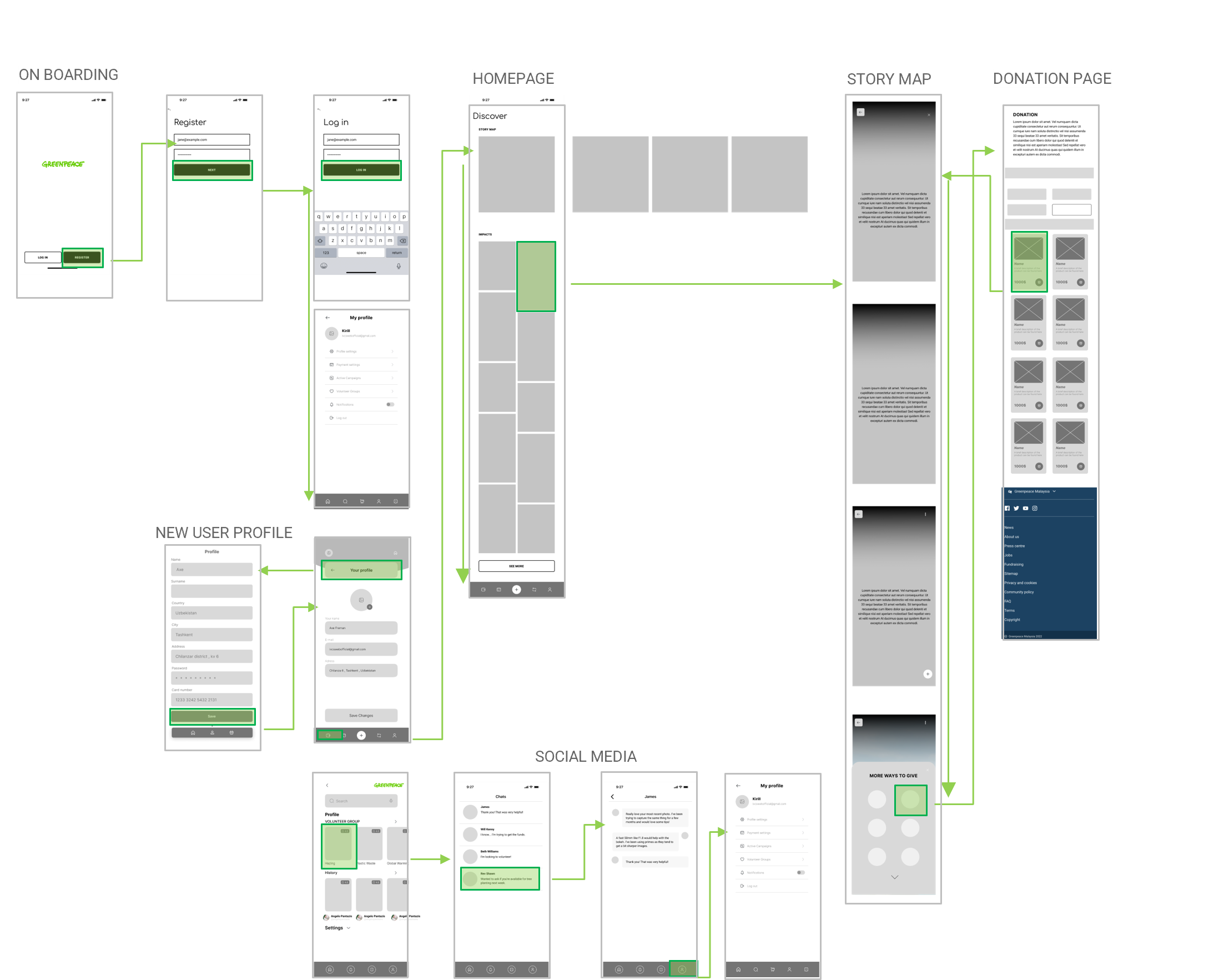
Based on the card sorting from the user testing, I created a user flow to organize the user experience and identify areas of opportunity and pain points.
Following card sorting, I identified areas of opportunity and pain points.

SECONDARY RESEARCH
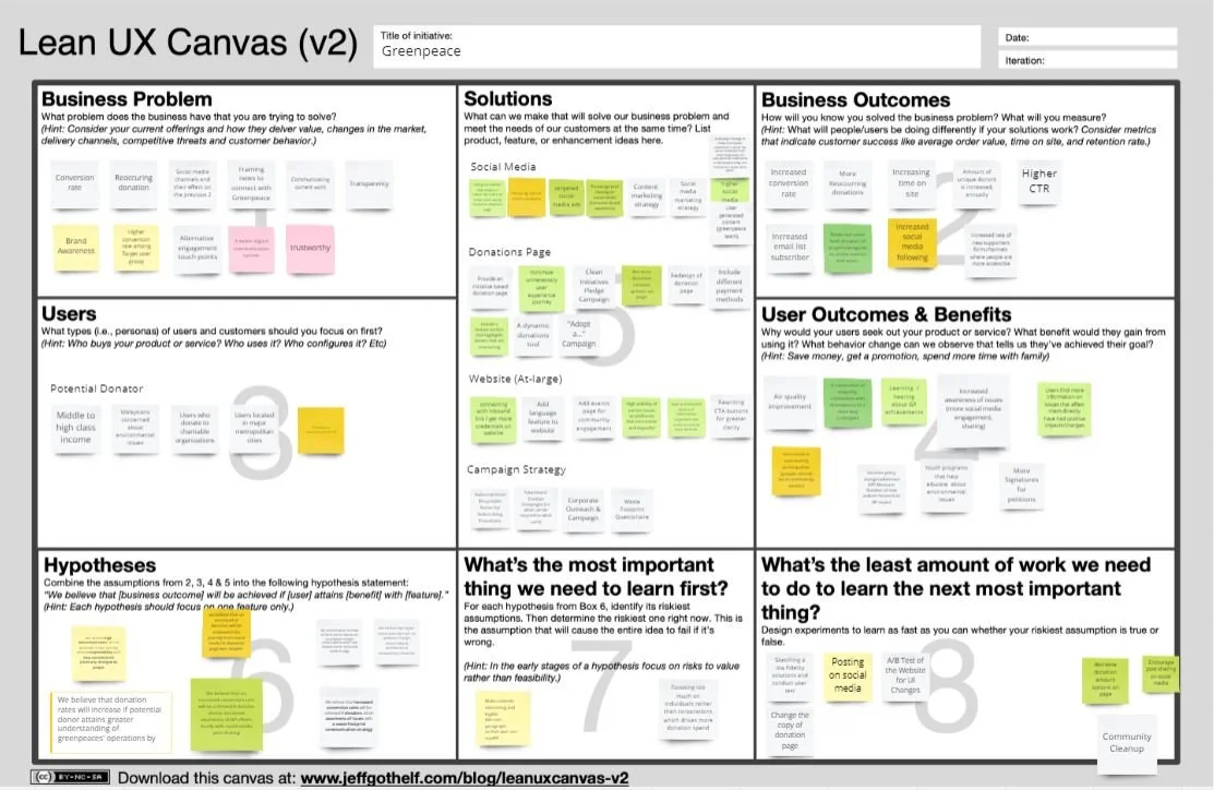
Synthesis
Identified key drivers.
We then synthesized our primary and secondary data into a Lean UX strategy by identifying the key drivers that attract new donors and motivate them to subscribe to monthly re-occurring donations.
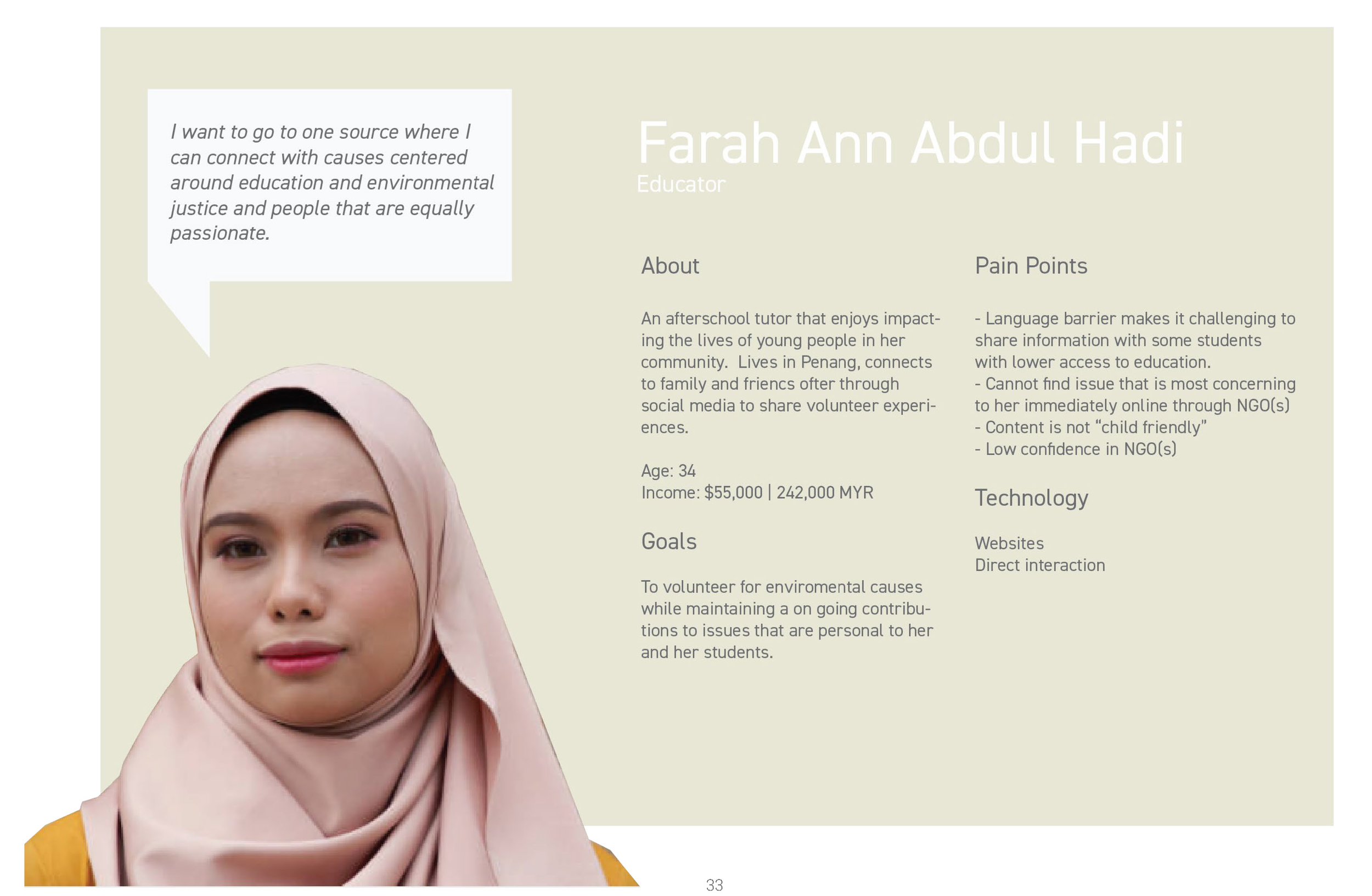
USER PERSONAS
I designed two user personas that represent the range of target donors.
Persona One represents users that the team has identified as middle income, target donor.

Persona Two represents the highest income level of target donors within the primary age group. Personal concerns as they relate to environmental and social conditions most affect them and align with their values.
04 / IDEATE & DESIGN
Information Architecture
From my research, I defined highlighted the primary components that funnel motivations to the donation page.
This helped to define the value proposition and features that bolster donations.

Sketching
After completing the research phase, the features, actions, and the content required were readily apparent.
I decided to make some quick sketches and map out the user flow. Sketching is a great way to iterate quickly and generate ideas while synthesizing the insights from the research.

Desktop Wireframing
I used a strategy that optimized their current content while introducing high-level new content that responded to various needs.
Sketching allowed me to quickly explore ideas and iterations before committing to a design strategy that I would begin to test. The Greenpeace Malaysia team had a limited budget therefore I used a strategy that optimized their current content while introducing high-level new content that responded to various needs.
The landing page and the donation page were the primary targets for introducing new content that would optimize the funnel. I reorganized the landing page to present the greater hierarchy of achievements, and values and highlight existing donors while giving the user the choice to learn more through an interactive story map.
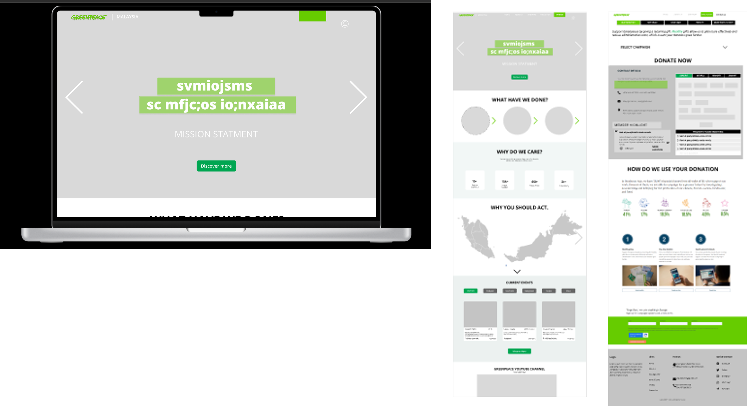
05 / WIREFRAMING
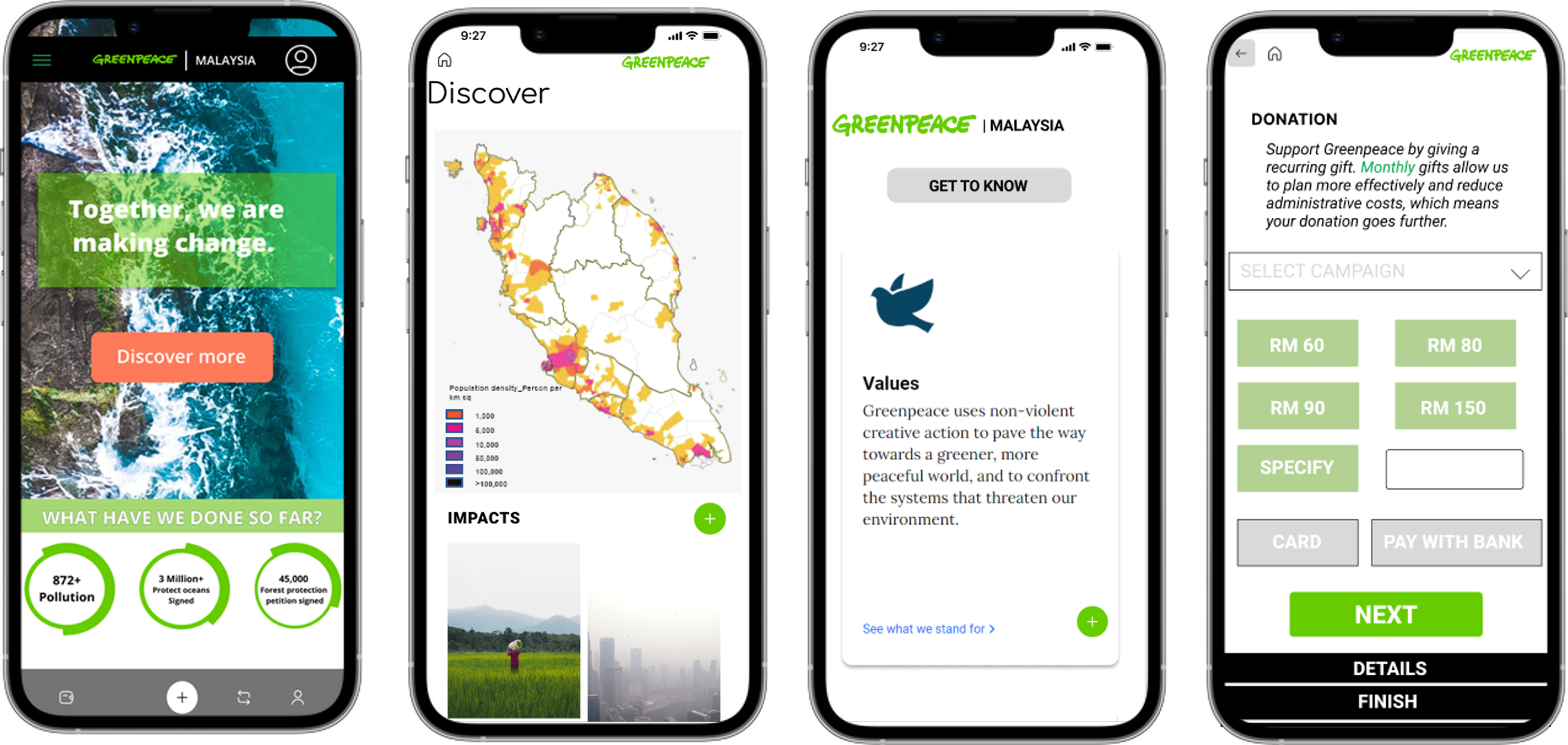
Mobile Wireframing
From both secondary and primary research, most of the users accessed information from their mobile devices, therefore, the mobile version of the site was also a critical part of optimizing the funnel experience for potential new donors.
06 / PROTOTYPING
The Solution
Let’s begin with hierarchy.

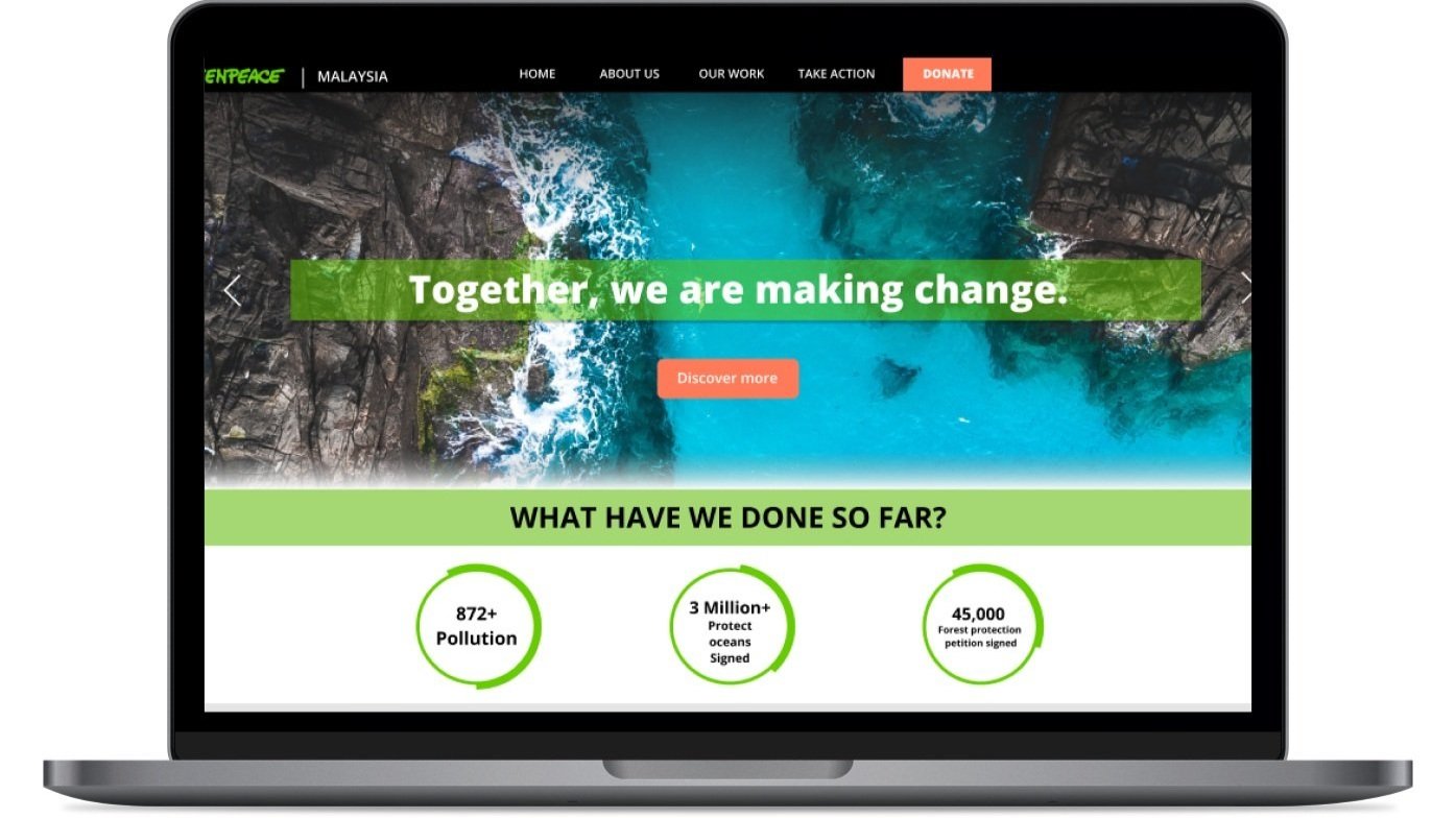
Banner headline with strong with catchphrase and GIF of recent location impacts
Emphasize achievements, milestones, and goals reached through infographics directly under the banner headline.
Color style primary color provides visual hierarchy.
1
The Solution
Connect through storytelling.

Story map allows users to locate themselves geospatially to nearest campaign impacts.
Connecting users to direct impacts help them to identify with causes and personal experiences.
Through mapping impacts, users are able to visualize how various issues overlap.
2
The Solution
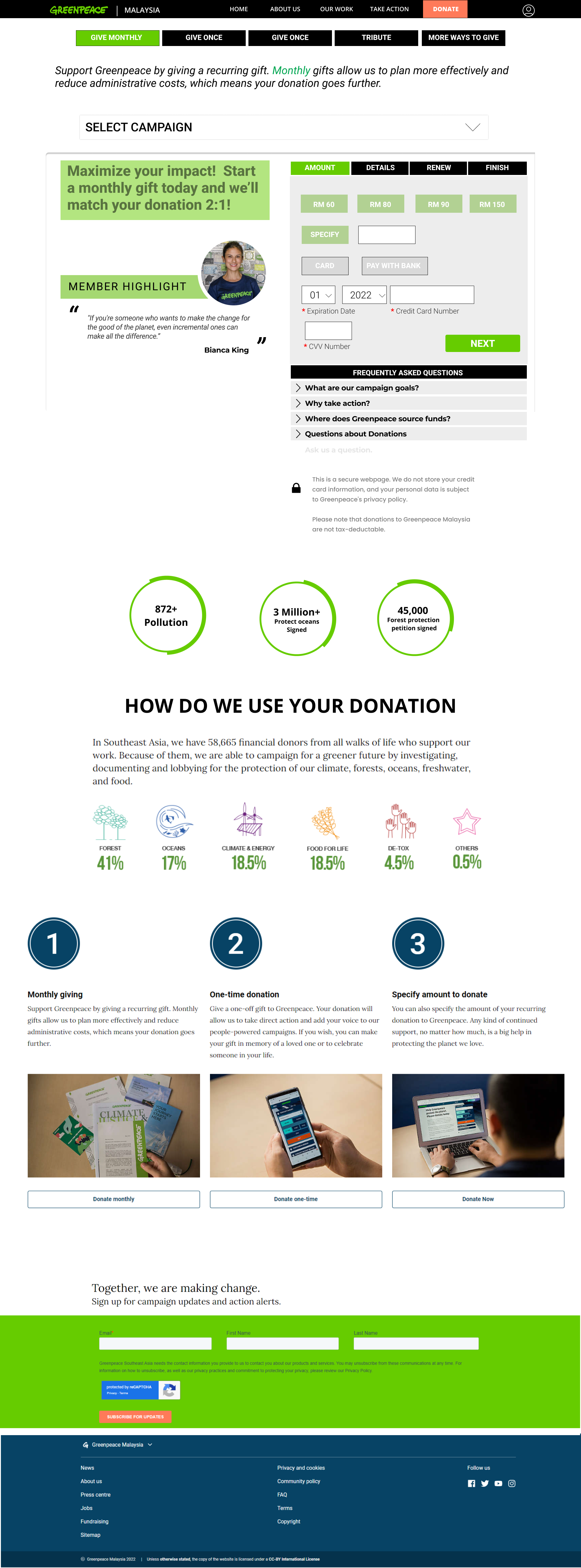
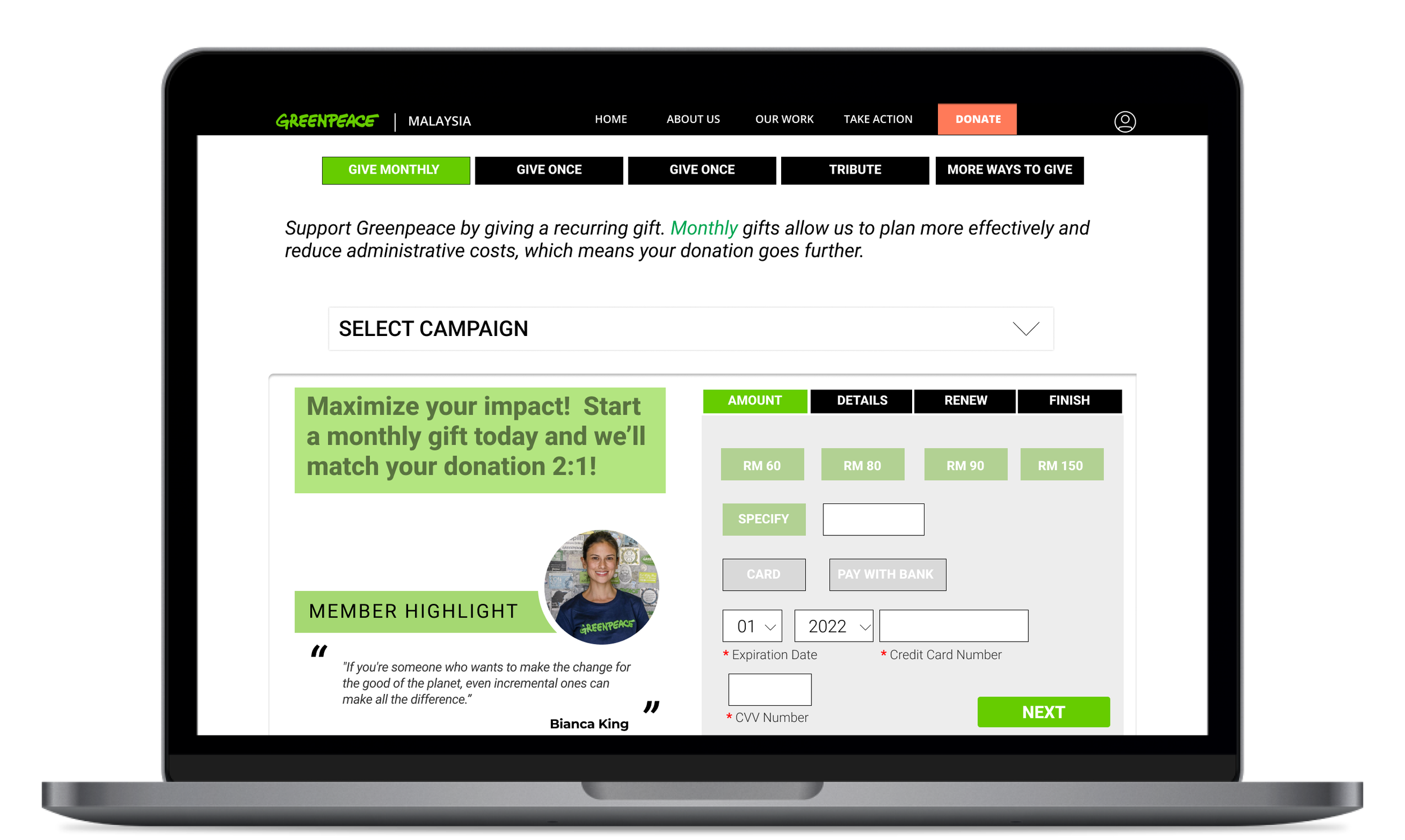
Diversify payment with ease.

Allow users to choose a campaign(s) they would like to donate through dropdown menu.
Diversify payment subscription options to allow users to decide on one time, monthly, or yearly donations.
Highlight campaign promotions and incentives to get users excited about their donations.
3
The Solution
Ensure user privacy by providing links to annual report, visibly place privacy guarantees, and website security.
Include milestones and achievements on the donation page to remind users of donation impacts.
Demonstrate how donations are allocated on donation page.

Increase transparency.
4
The Solution
Create more ways to connect.
Once the user sets up their profile through donation they can access social media and volunteer groups.
Links to social media groups are provided in the profile so that volunteers can connect to other Greenpeace advocates.
Connecting with other advocates reinforces accountability and increases the likelihood of repeated donations.
5
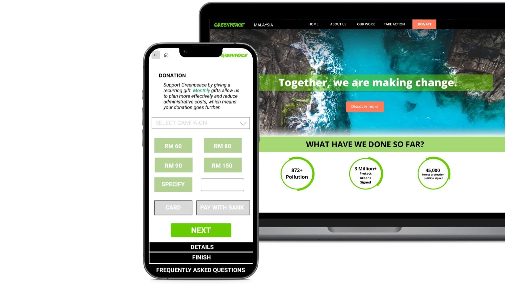
Landing Page
After completing a couple of paper iterations I had the general user flow mapped out. It is time to transition to the digital world where I could further iterate in Sketch.
The landing page is divided into four sections based on user questions and order in which they engaged with the page. Bold headlines with either questions or statements clearly stand out.

Donation Page
The donation page prioritizes the user’s sense of security and control when completing the donation process by providing information on campaign success and guarantees transaction security .
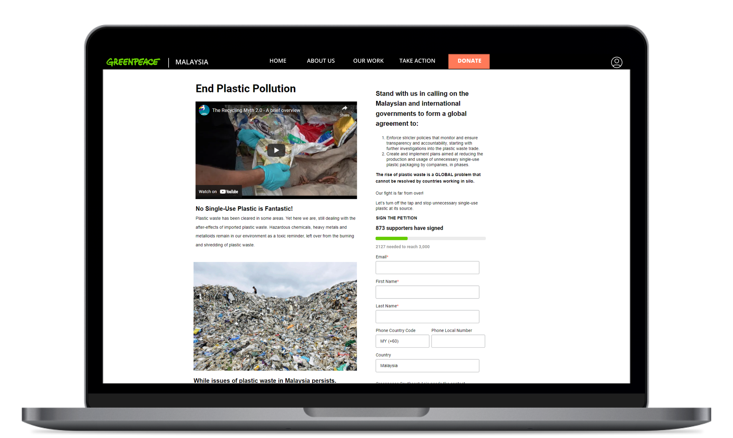
PROTOTYPE
-
![]()
Landing Page
-
![]()
Story Map
-
![]()
Impact Vidoes
-
![]()
Donation Page
-
![]()
Campaign Page


The Mobile experience.
Take Aways.
Inspire Within Constraints
As a designer, it was important for me to find ways to inspire while remaining within the scope of the project. Through my research, I found that creating an emotional or personal connection increases donor motivation. Further iterations of the story map would have included animations that would allow the user to scroll through the story by selecting an Area of Interest that would then take them through various impacts that affect the user locally. The current map in the prototype is an illustration of that experience framed by ArchGIS data and overlayed in ArcMap. This was to suggest strategies that could fit within the current budget but could also be advanced later.
Sketch & List Priorities
As my first UX Project with The Harness Projects, the challenge of iterating quickly was a great learning experience. I found that sketching my ideas early helped me to narrow down the design to focus on key insights that we derived through interviews, the target donor insights provided by Greenpeace, and data analytics from other sources. Tying all of the information together under a prioritized list, the most important question, “How do you increase awareness”, became apparent and made the process highly focused and clear.